Recicladora Industrial Mty
Client Recicladora Industrial Monterrey is a recycling company focused on creating rubber from tires. Seeking to be widely known in the state and expand to the whole country with their new approach to the recycling business.
Problem Creating an image that helps them establish as a strong and serious competitor in the market full of big and older companies.
RIM ask me to help them to create their branding and website reflecting their values as a young and professional company. Separating themselves from the competitors with a new way of working.
The Challenge Create a branding and website with an authentic feel, without having some of the very used elements and colors related to recycling companies.
My Role I was in charge of the whole project, making the new branding and website.
- Avoid the recycling symbol and create a new one.
- Create a simple, short and memorable mark.
- Simple and easy to navigate website.
If you go and look for recycling businesses you get flooded with the ♻️ symbols, leaves and bright greenish colors. We wanted to move away from that, I went for other ways to differentiate and represent it. Taking references from the main focus of the company, tires, I took advantage of the name as is already very descriptive, so I opted for something subtle and abstract.
I came up with a round shape representing a tire, they’re similar figures around in a disorderly manner, symbolizing the pollution and waste. RIM joins them and makes them as one, in something useful and newly represented in the center.

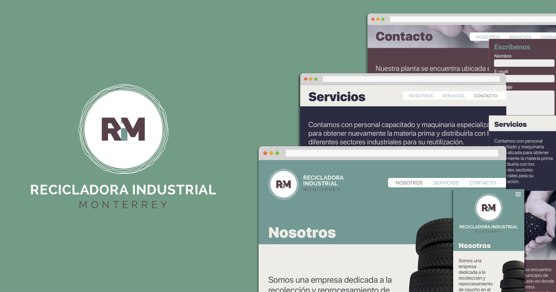
They also needed a strong and elegant mark to be used alone or accompanied by the symbol without losing its identity. I connect the acronyms of the name, in a way, recycling the “i” letter as part of the ”M” to become clear, simple and memorable.
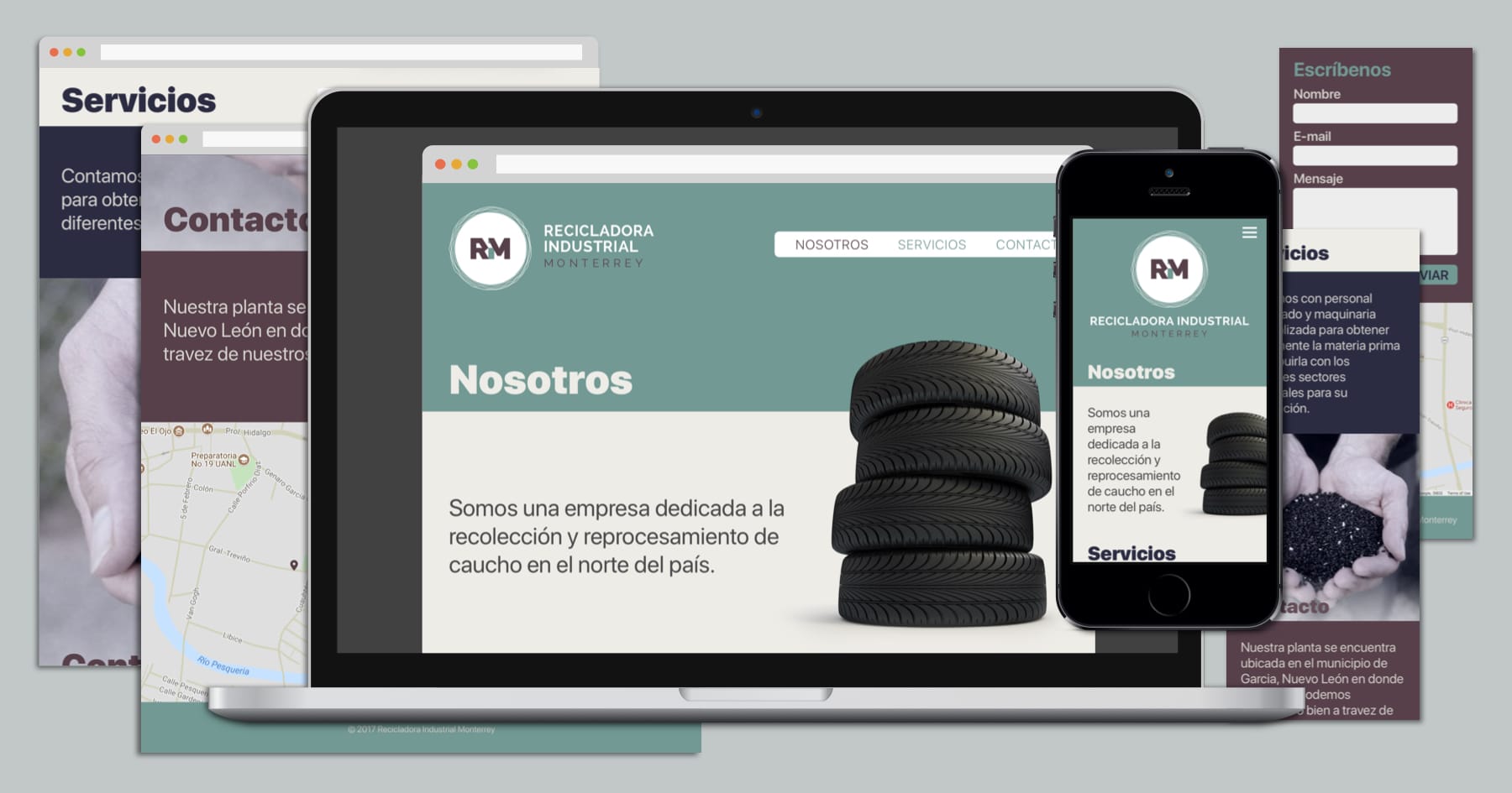
Now, the website wasn’t complicated at all, they just needed a basic one with their information and show ways to be contacted. It fallows the brand simpleness with clear and concise text, few colors and good photos to end with an elegant and straightforward site.