Extra Servicios
Client Extra Servicios is a new company servicing hotels and enterprises covering professional cleaning and private security.
Problem Struggling with getting new clients to trust them without any kind of branding or website, they want to present themselves in a way that can help them look as a serious and professional company.
As they started with small group of clients and their good work was enough, now they’re trying to grow but they’re having troubles closing new deals.
The Challenge Create and give Extra Servicios a professional look and maintaining a balance representing their two very different services areas, cleaning and private security.
My Role I was in charge of the whole project, making the new branding and website.
- Design a simple mark that represents the company.
- Define branding colors and fonts.
- Create the different applications of the brand.
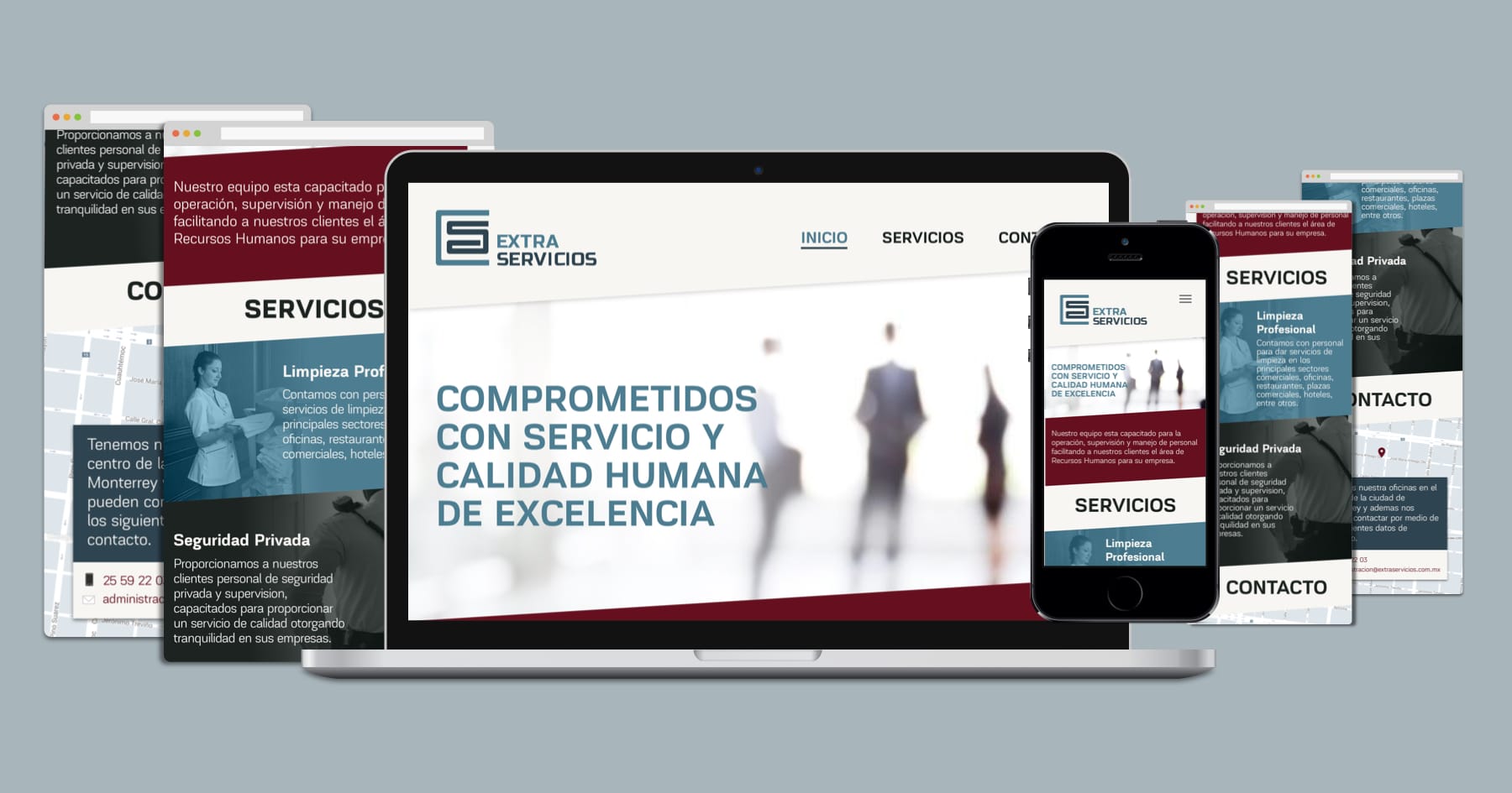
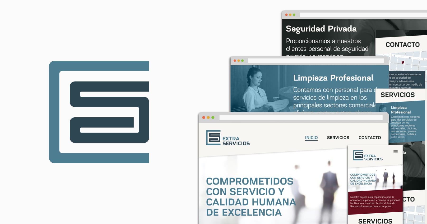
- Simple and clear one page website.
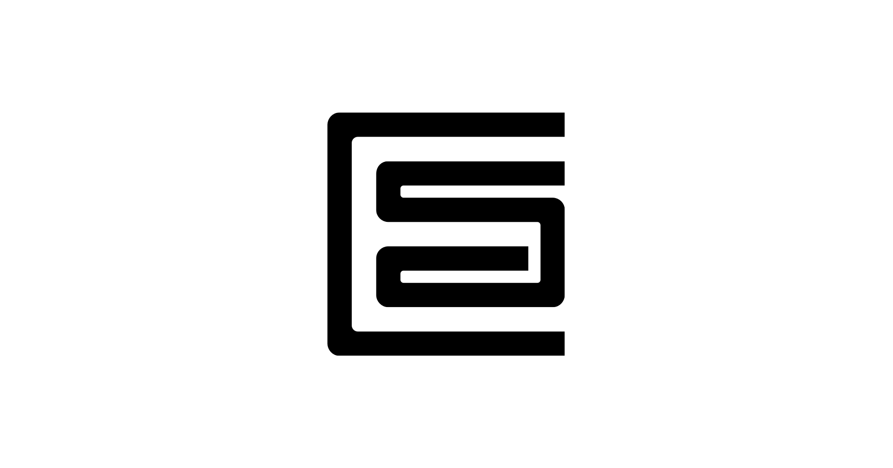
Just starting the project I found interesting how different you can represent the two main services they offer. I wanted a rememberable mark for the company, is not easy to create an element that embodies cleaning and security at the same time. The other problem is they offer other small services for some of their clients, so the best was focus on the name as it already has a big meaning for his clients (Extra Services).
I create a monogram merging the letters “E” and “S” in a way that conveys simplicity and modernity with the geometry of the symbol, adding some curves to give a less rigid and more human form. The “E” appears using the negative space, giving a creative and interesting visual effect. Communicating that “Extra” the company delivers.
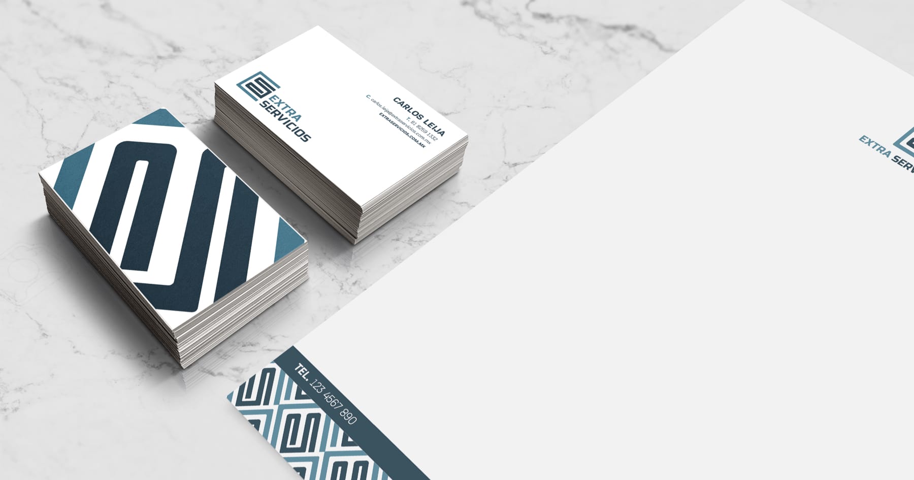
For the colors I choose a combination that can relate to the freshness of cleaning and the soberness of security, with other supporting colors following the same idea. The primary font is Akzentica 4F, a modern and geometric sans serif that fits with the brand and monogram, creating the full logo.
Next step, creating the different applications and media to complete the entire brand identity, that will serve as the style guide of the look and feel the website should have.
The website just needed the company information, to a have a presence and a way to be contacted. So to not overcomplicate things I made it as a one-page site, easy, clear and fast to read all the information.