Chromite Comercial
Client Chromite is a company dedicated and committed to the auto-parts market in Mexico. Producing and exporting products for more than 25 years.
Problem They've been using the same image since the beginning so their design looked outdated and they also needed another way to show all their inventory as printing catalogs are slow and outdated.
Chromite Comercial is a company in the automotive industry and as many in that area they haven’t changed his ways for doing things for many years but they had an opportunity to improve that and open themselves to more clients and markets.
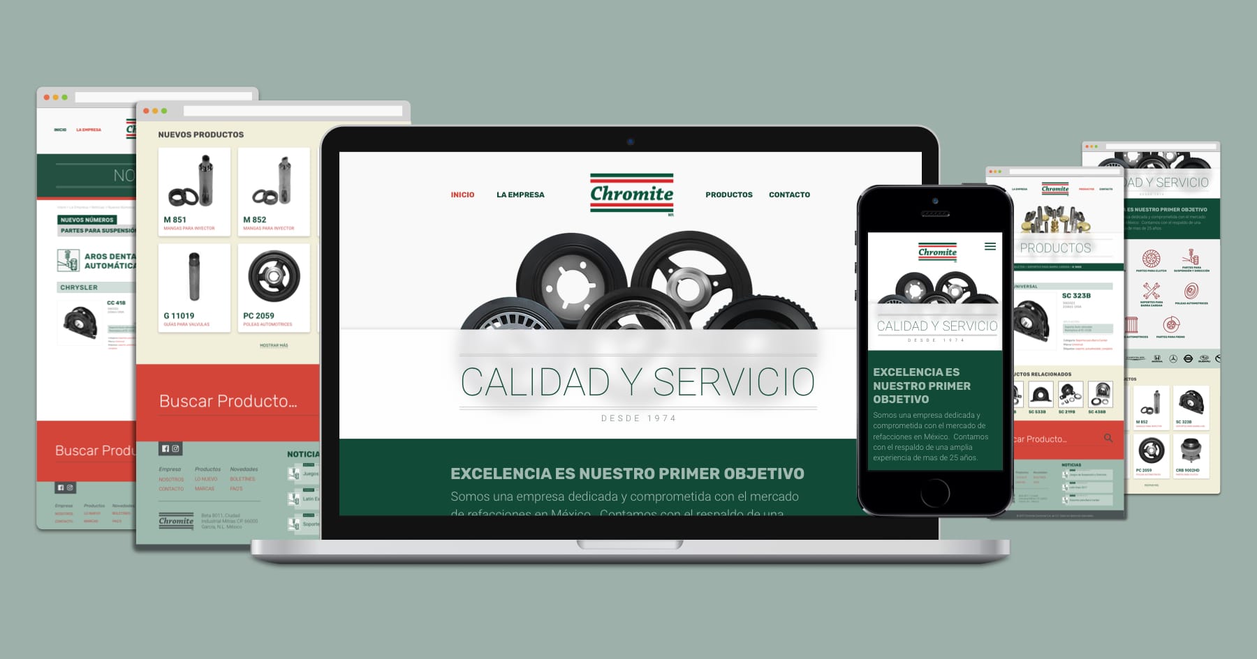
The Challenge Create an updated look and still look like them, so they don’t lose the brand familiarity that his clients are used to after that many years and build an online site so their inventory can be accessible to anyone.
My Role I was in charge of the whole project, making the design for the new branding, doing the website screens and writing the code to build it.
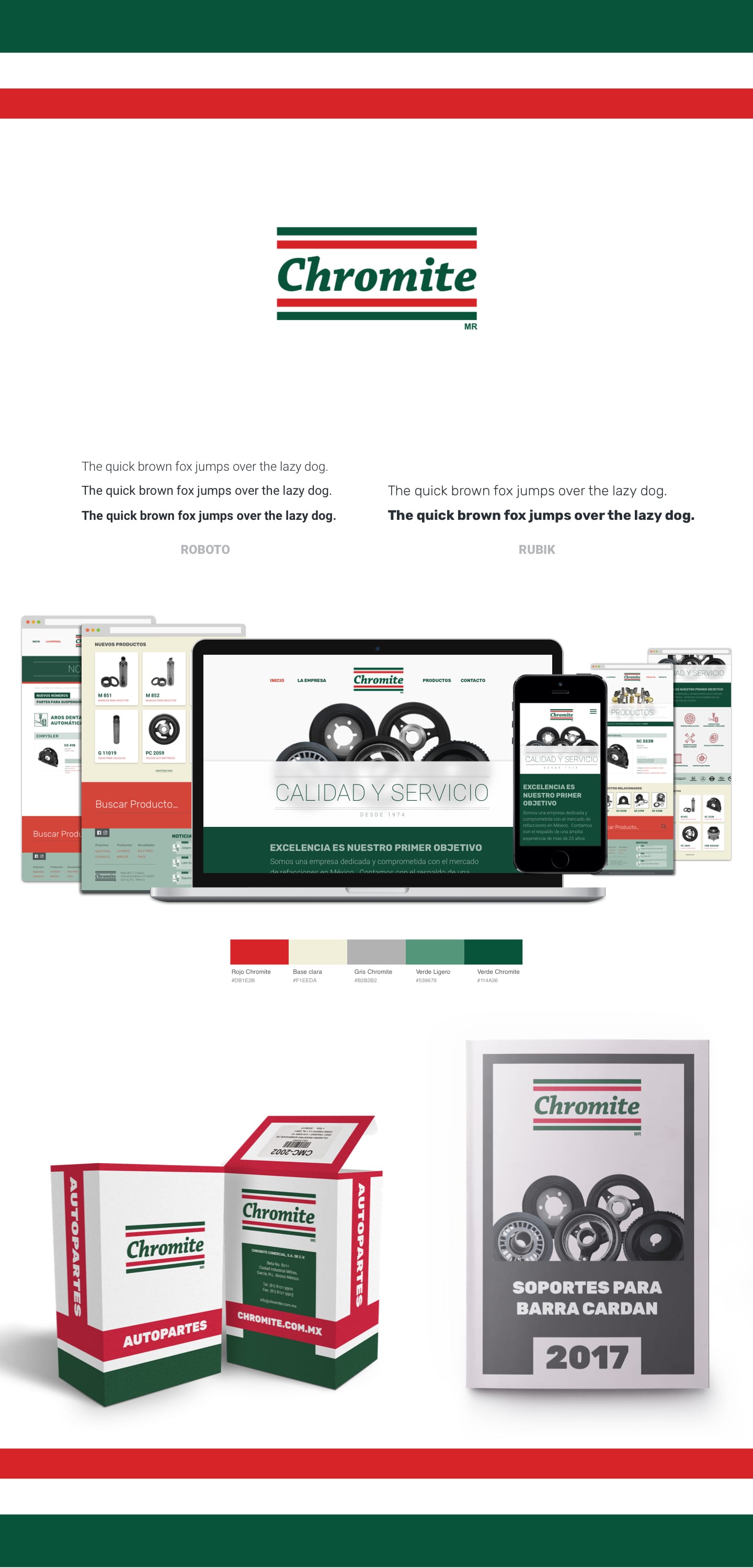
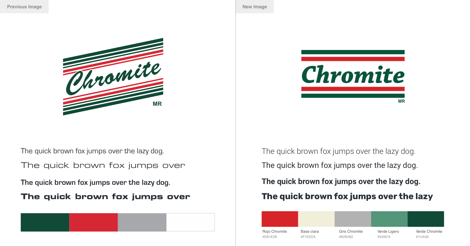
- Updated and still recognizable image.
- Have a familiar UX on the site.
- Filtered search results.
- New look and feel of the entire brand.
I’ve been helping Chromite for many years now since I was still in college, so I know the company quite well. At the beginning I help them with some editorial design, updating their product catalogs. I never liked their image but they were using it the same logo, fonts, and colors for all these years, they weren’t very keen to change all of it.
Years passed by and I kept working with them on other projects, one day while trying to fit my designs in their very outdated branding, I just had enough. I present to Rafael (Chromite’s Director) a plan of how much they can improve by trying newer things without losing their essence and look like another company altogether, he agrees and I start working right away. The new branding should still look like Chromite, that was something I focused on. I started with the logo, I got rid of the brush script font, the angled shape and from that many elements.
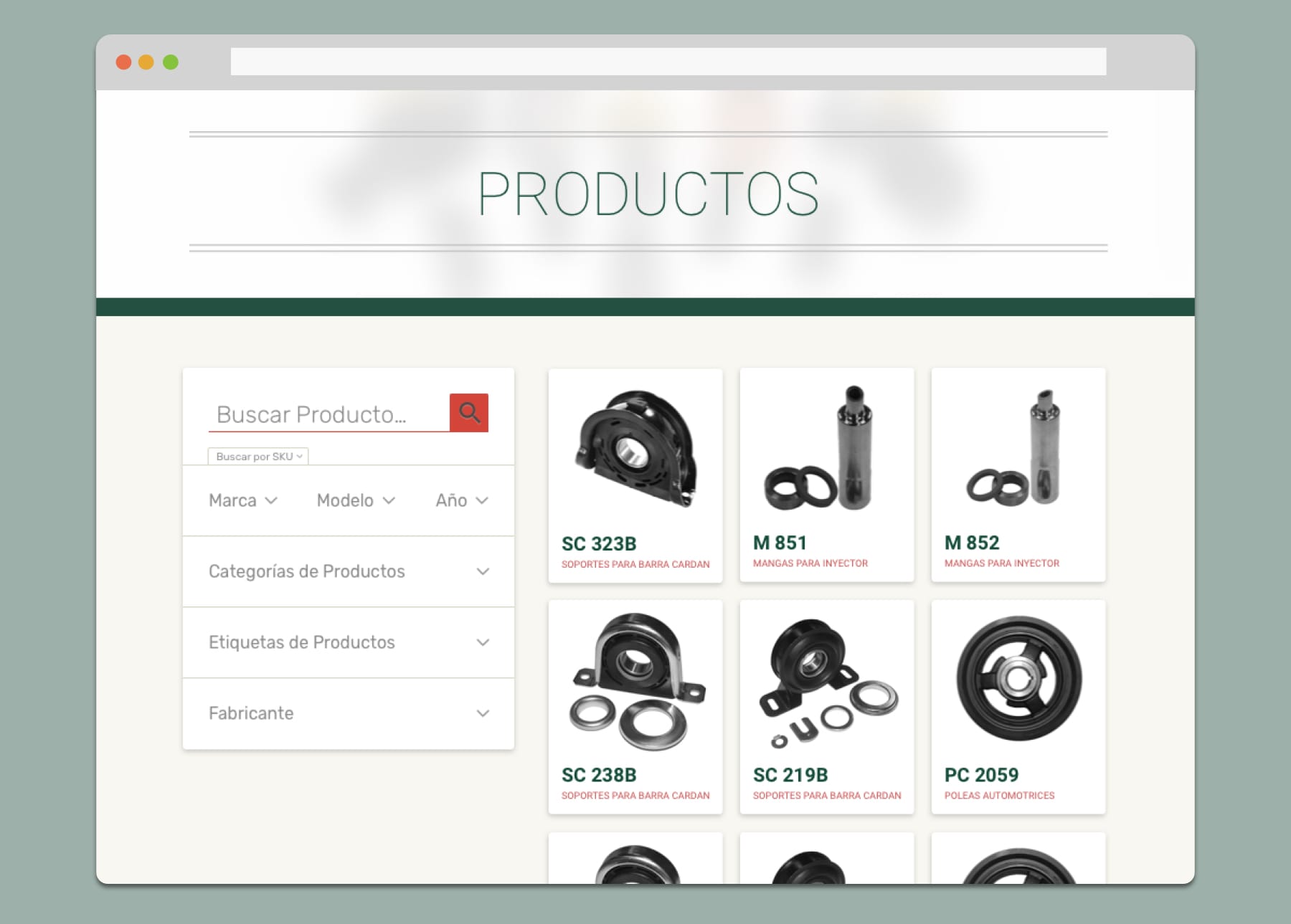
They needed a proper site, a way to show all their products and little by little move away from print thousands of catalogs and deliver them, we will still print some but a fraction and the cost will go down drastically. As their main clients, like most people in the automotive industry, are not very tech savvy and have around 45 to 60 year old. The site had to be very simple, clear and familiar to the visitors. No reinventing the wheel this time, a flow that most people are used to by using popular e-commerce sites.
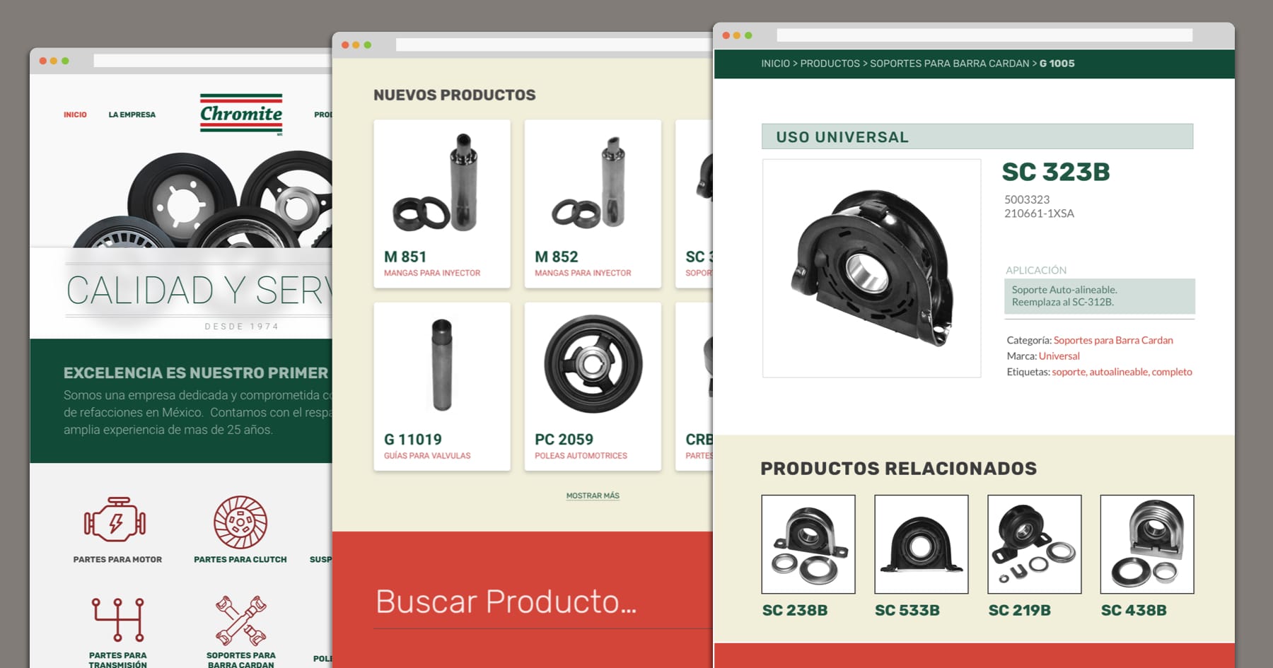
Another important thing was to include the monthly newsletters and move from the pdf format they’ve been using and sending to their clients to a more friendlier and flexible way in the website. I incorporate them into an individual page with the group of new products of that newsletter with options to see all the information of every part or see it individually with bigger pictures.
And how do people will find the right part they’re looking for? it all depends on a good search and enough filters, specifically for looking pieces of a certain brand, model or year. So I integrate a varied filter system to the website search so it doesn’t frustrate anyone and find something can be very straightforward.
Overall I helped update the entire branding, resulting in a more professional and contemporary look, caring for their clients by having easier and clearer ways to share their products. Ready for what’s next and going strong for another 25 years.